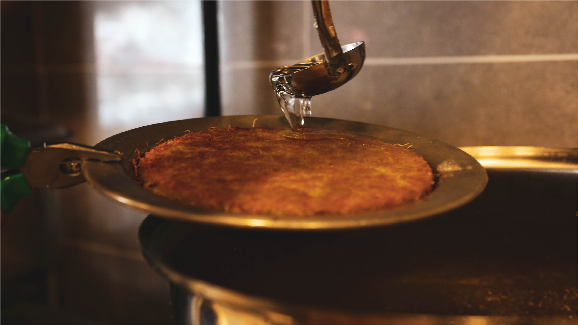
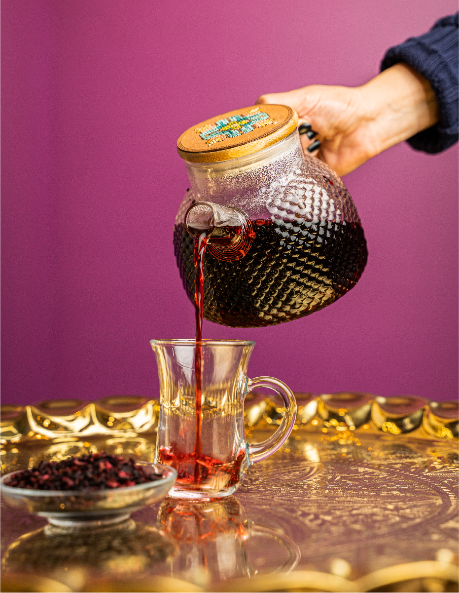
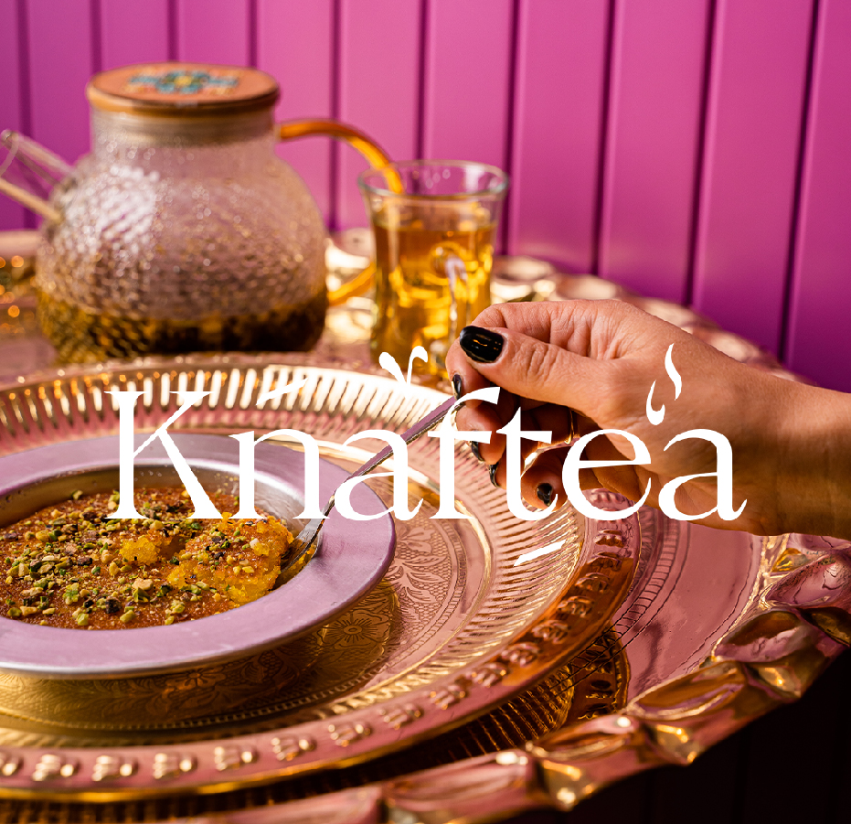
REQUIREMENT In the heart of Jerusalem, three enterprising women defied the norms to birth ‘Knaftea’ – a haven for lovers of the traditional Palestinian dessert, Knafe, and a curated blend of teas. In a place where it’s relatively uncommon for Arab women to helm their own ventures, these three trailblazers have not only established a business but also brought together the warmth of traditional flavors with the creativity of new blends. Their tea offerings, infused with both quintessentially Palestinian ingredients like sage and mint, as well as diverse flavors like hibiscus, speak of their commitment to bridging the old with the new.
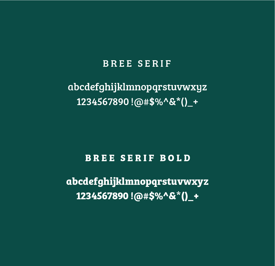
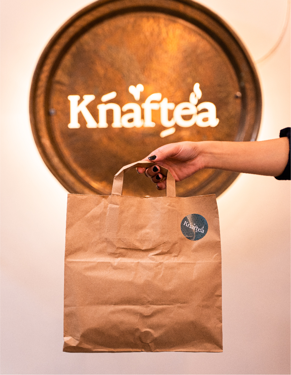
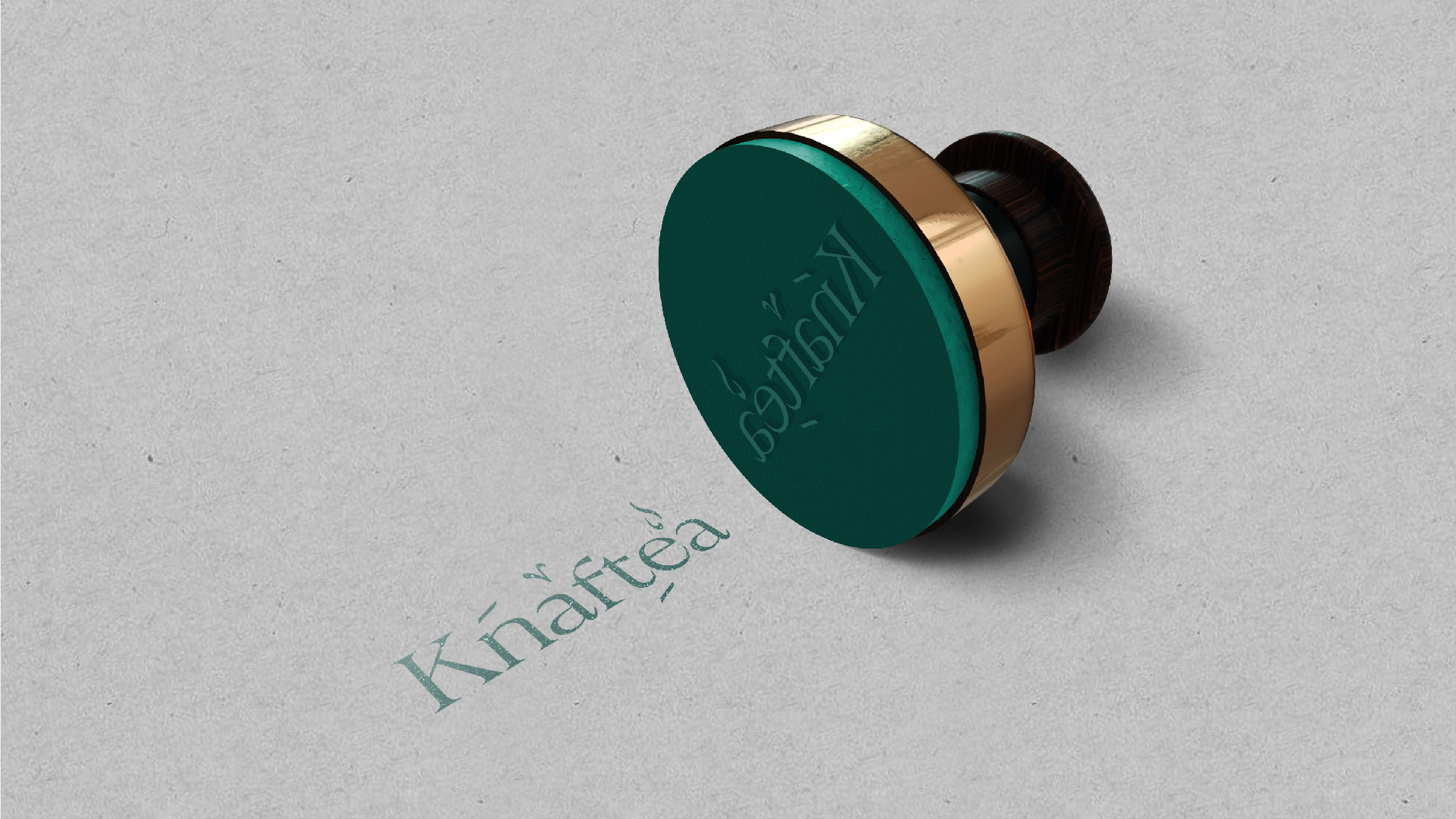
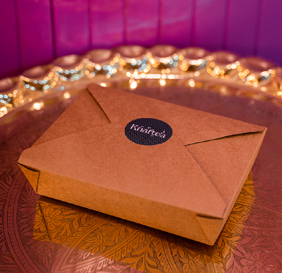
OUR ANSWER Our branding direction for ‘Knaftea’ was deeply rooted in honoring its Arab identity. By integrating design accents from Arabic script into the English wordmark, we created a visual dialogue between the brand’s heritage and its contemporary expression. The chosen palette of dark green resonates with the traditional teas and the richness of Palestinian culture, while the muted pink introduces a modern, feminine touch, subtly nodding to the three women behind this endeavor. The final design is a harmonious blend of tradition and innovation, perfectly encapsulating the essence of ‘Knaftea’ and the pioneering spirit of its founders.