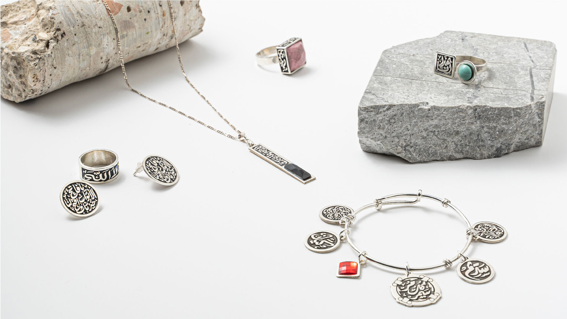
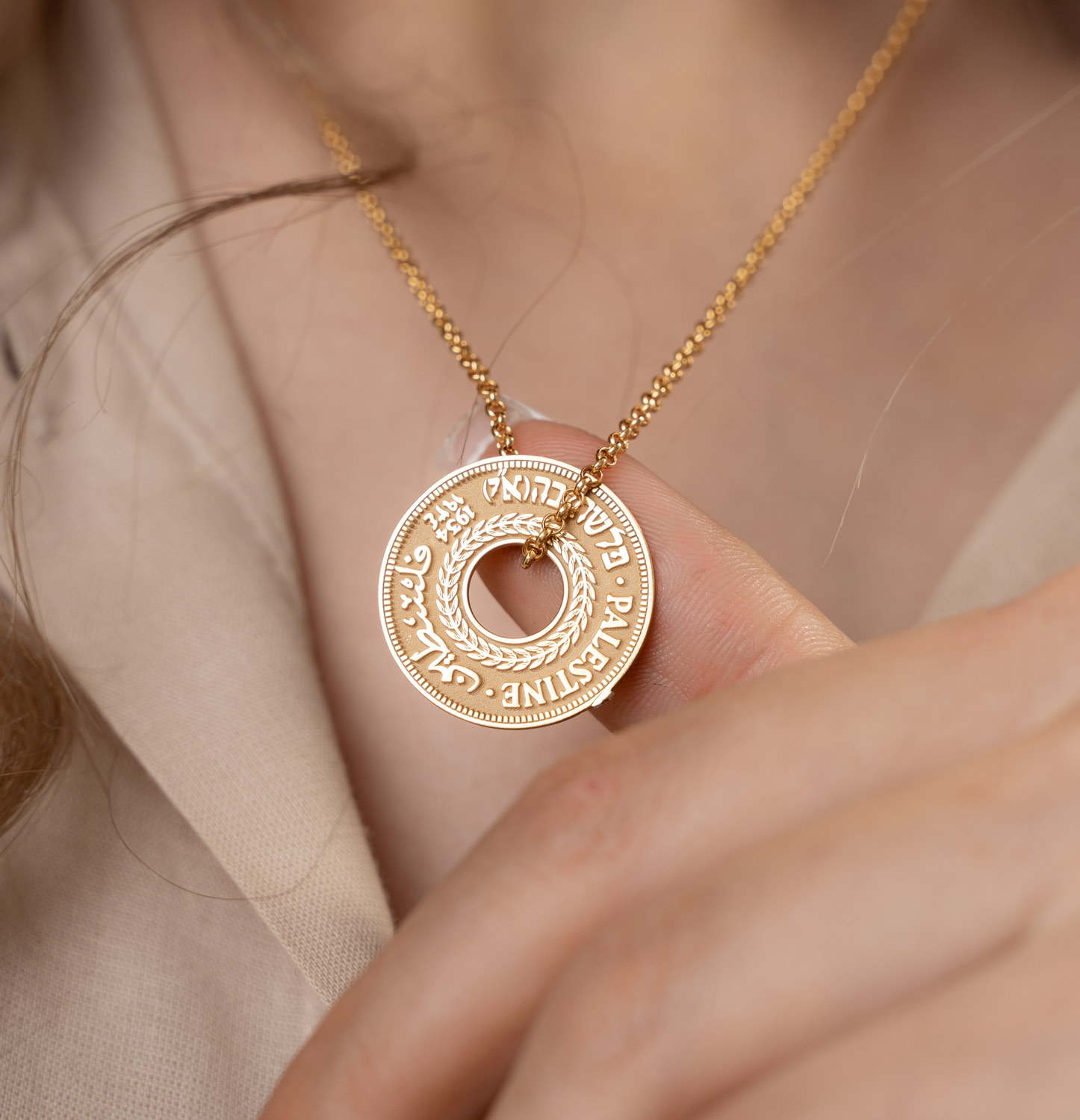
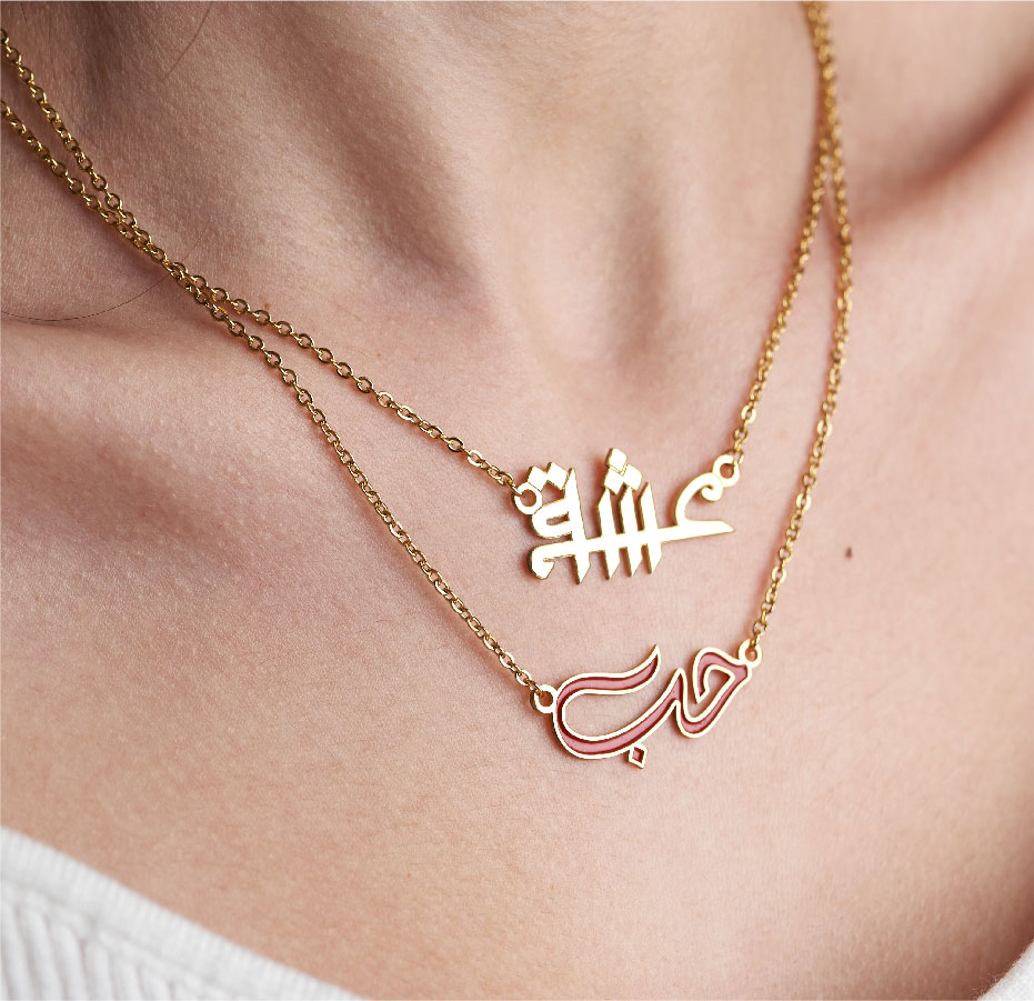
REQUIREMENT Lamassaty stands as a testament to the vision of its founder, a woman whose craft lies in weaving stories through jewelry. The designs, deeply rooted in both Palestinian and broader motifs, bring to life the intricate tapestry of cultures and narratives. A significant portion of her collection revolves around bespoke calligraphic pieces, which encapsulate names, poignant quotes from popular culture, verses of poetry, and religious inscriptions. Given the nuanced and delicate nature of her work, the brand image needed to reflect this sophistication while paying homage to its origins.
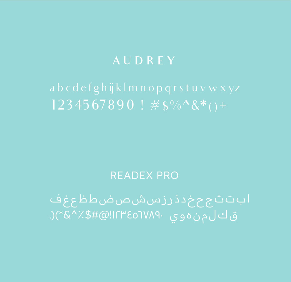
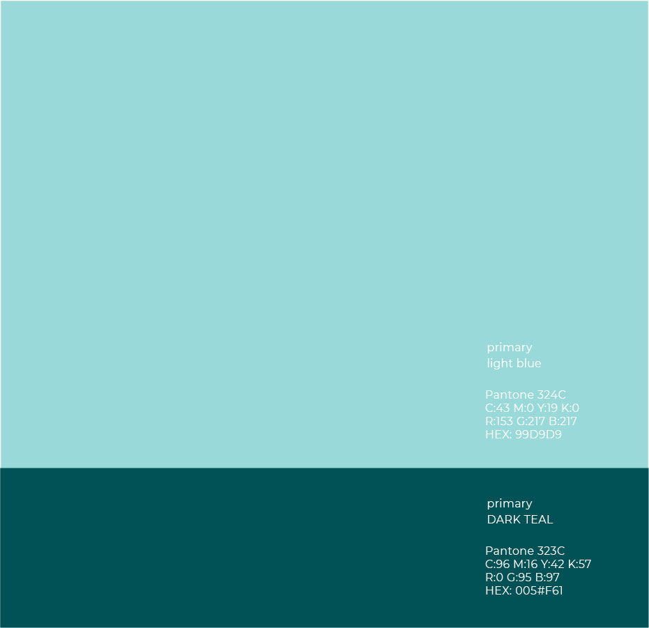
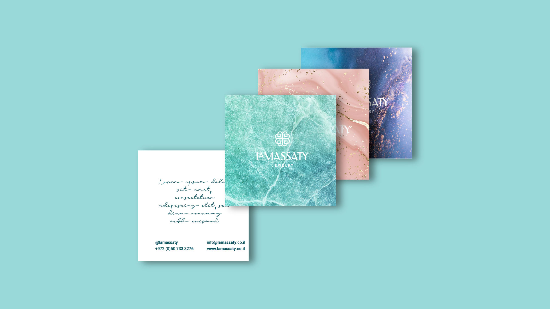
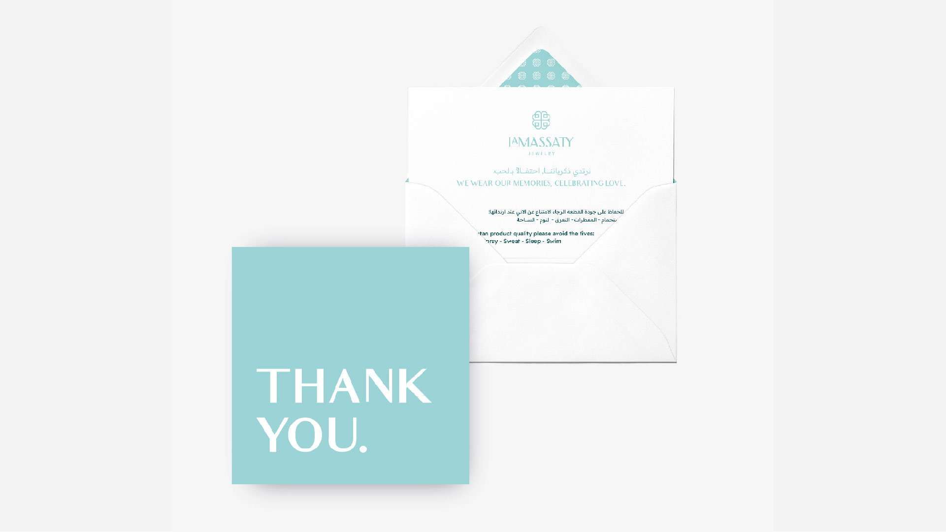
OUR ANSWER For Lamassaty, our design strategy was twofold. First, to represent the finesse and intricacy of the jewelry, we incorporated design elements that mirror the precision of calligraphy and the elegance of her creations. Secondly, drawing inspiration from traditional Palestinian tile work, we fashioned an icon that, while evoking memories of the original logo, sits comfortably in the contemporary space. The choice of turquoise/teal as the dominant color scheme is a thoughtful nod to the semi-precious stone often found gracing her pieces, intertwining both brand identity and product narrative. In its entirety, the branding for Lamassaty is a delicate balance between the rich traditions from which it draws inspiration and the modernity it embodies.